
Design tokens explained: a practical guide for product teams
Your team decides to update the primary button colour. A designer changes it in Figma. A developer updates it in the stylesheet. Then someone finds three more places where it was hardcoded. Then two more. A week later, the button is still three different shades of blue depending on which screen you’re on.
This is not a design problem. It’s an infrastructure problem. And it has a name: the absence of design tokens.
Design tokens are not a designer’s tool or a developer’s concern – they’re the shared language that keeps your product visually coherent across every team, every tool, and every AI-generated screen. Without them, every visual decision your product has ever made exists somewhere – in a design file, in a stylesheet, in someone’s memory – but nowhere all at once. With them, a single change propagates everywhere, automatically.
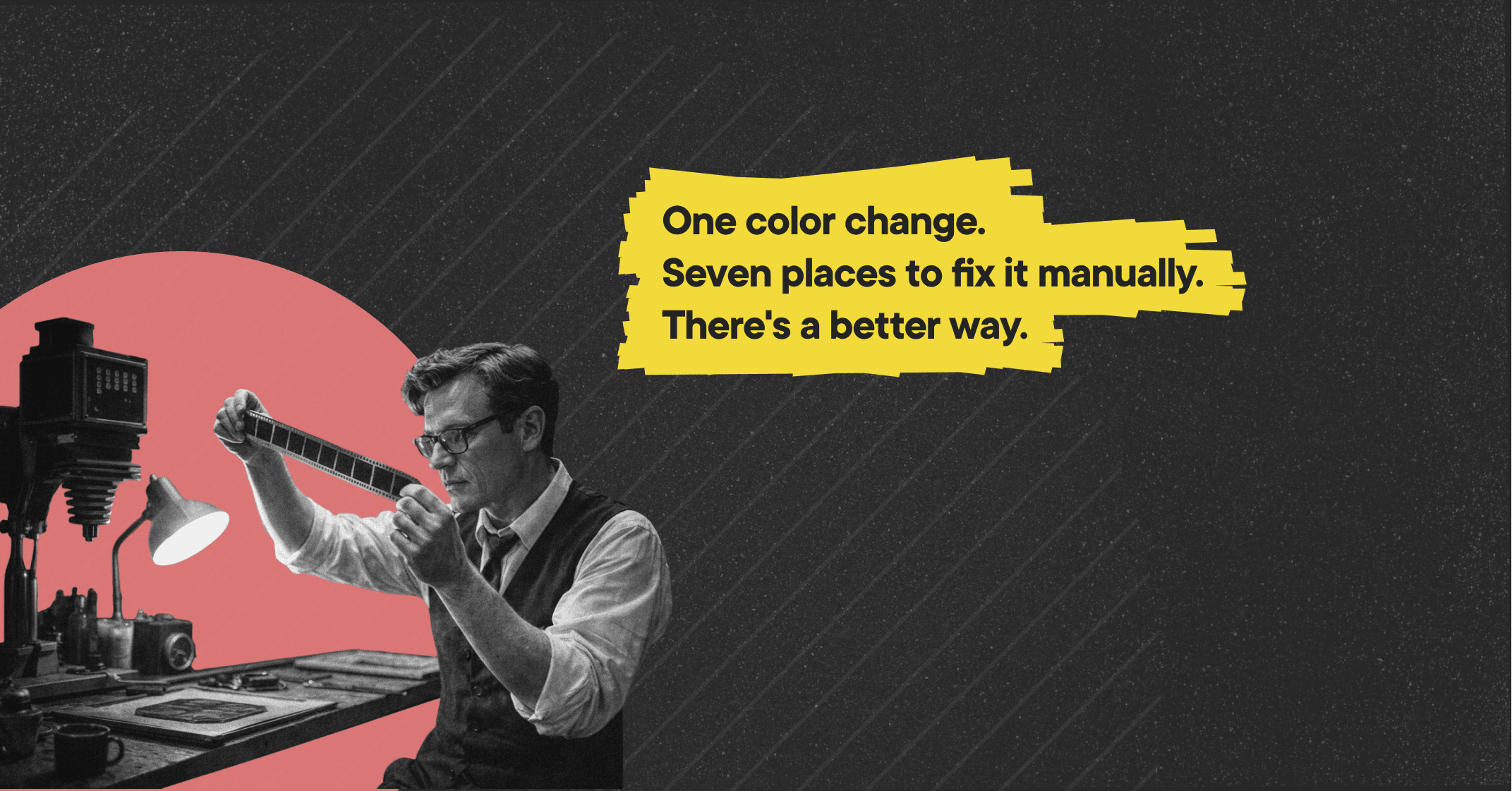
Table of contents
What are design tokens
A design token is not a colour, a font size, or a spacing value. A design token is a named variable that stores a visual decision. The difference matters: #1A73E8 is a value. color-button-primary is a decision. One describes what something looks like. The other describes what something means.
This distinction is the entire point of design tokens. When you store visual decisions as named variables rather than hardcoded values, two things become possible that weren’t before. First, a single change to a token propagates automatically to every component that references it – in your design tool and in your codebase simultaneously. Second, every tool working with your product – including AI tools like Cursor, Claude Code, and Figma Make – has a shared reference for what your visual decisions actually are. Without a token architecture, those tools infer from whatever they can find in the codebase – and infer inconsistently, because the codebase is inconsistent.
Pro tip: A quick way to check whether your product uses design tokens or hardcoded values: ask a developer how long it would take to change the primary button colour across the entire product. If the answer is anything other than “a few minutes”, you have hardcoded values – not tokens.
Why design tokens matter in 2026 – the AI angle
AI tools generate UI faster than any team has been able to before. Cursor builds a new settings screen, Claude Code ships an onboarding flow, Figma Make prototypes a new feature in an afternoon. The productivity gains are real, and using AI in product development is one of the smartest decisions an engineering team can make right now.
But every AI tool works from available context. When it generates a button, it infers the colour, spacing, and typography from whatever it can find in the codebase or the prompt. If your visual decisions are hardcoded and scattered, the tool infers inconsistently – because the codebase is inconsistent. Each session produces output that is close to your visual language, but not quite the same.
Design tokens change this. A well-structured token architecture gives AI tools a single, unambiguous reference for every visual decision in your product. Instead of inferring, the tool reads. Instead of approximating, it applies. The output is consistent not because the AI got lucky, but because the infrastructure made inconsistency impossible.
This is why design tokens are the most critical component of an AI-ready design system – not components, not documentation, but tokens, because they’re the layer AI tools actually work from.
The three types of design tokens you need to know
Most teams that struggle with token implementation are working with a flat structure – one layer of tokens that tries to do everything at once. The result is a system that’s hard to maintain, hard to extend, and impossible for AI tools to use reliably. A well-structured token architecture has three layers.
Global tokens
Global tokens are raw values – they define every possible value in your visual palette, every colour, every spacing step, every type size, without any reference to how those values are used. Example: color-blue-500: #1A73E8. They are the foundation of the system, never referenced directly in components, existing solely as a source of truth for alias tokens to draw from.
Alias tokens
Alias tokens are semantic – they describe the purpose of a visual decision rather than its value. An alias token doesn’t store a colour; it references a global token and gives that colour a meaning. Example: color-button-primary: {color-blue-500}. When you change color-button-primary from {color-blue-500} to {color-green-500}, every component that references it updates automatically – no search and replace, no missed instances.
Component tokens
Component tokens are the most specific layer, mapping alias tokens to individual components and their states. Example: button-background-default: {color-button-primary}. They exist because different components may use the same alias token differently, giving you precise control at the component level without breaking the chain of reference that makes the whole system work.
Watch out: Most token system failures happen when teams skip the alias layer and map global tokens directly to components. It works until you need to change something – then you discover that changing one global token breaks ten things you didn’t intend to touch.
How to name design tokens – the decision that determines everything
Token naming is the most consequential decision in a token system. A token named after its value – color-blue – is accurate today and misleading the moment your primary button colour changes to green. A token named after its purpose – color-button-primary – remains accurate regardless of what value it holds.
Three principles for naming design tokens:
Name for purpose, not appearance. color-text-error tells you what the token does. color-red tells you what it looks like. When your brand updates its error colour from red to orange, color-text-error stays true – while color-redbecomes a lie that propagates through every component that references it.
Use a consistent naming structure. A reliable pattern: category-property-variant-state. Applied: color-button-primary-hover. Every token follows the same logic, which makes the system navigable by people who didn’t build it – and by AI tools that need to understand it programmatically.
Separate what something is from what it does. Global tokens describe what something is (color-blue-500). Alias tokens describe what it does (color-button-primary). Keeping these layers distinct is what makes the system maintainable. Blending them – naming a token color-primary-blue – collapses that distinction and makes every future change more fragile than it needs to be.
Pro tip: Token naming directly affects how well Cursor and Claude Code can use your design system. Semantically named tokens give AI tools the context they need to apply the right token in the right place. Tokens named after values require the AI to guess intent – and guesses compound into inconsistency.
Design tokens in practice – from design tool to code
A token system only works when it exists in both your design tool and your codebase, and when both environments stay in sync. Here is how that process works in practice.
Step 1: Define tokens in your design tool. Most design tools support token management either natively or through plugins. In Figma, Token Studio is the most widely used plugin for defining and managing all three token layers. Sketchhandles tokens through its native variables system or third-party plugins. Penpot supports design tokens as part of its open-source infrastructure. Regardless of the tool, the goal is the same: a structured, exportable definition of every visual decision in your product.
Step 2: Export to JSON. Most token management tools export your token architecture as a JSON file – a format both design and engineering environments can read, and that version control can track alongside your codebase.
Step 3: Transform tokens for the codebase. Tools like Style Dictionary take the JSON token file and transform it into whatever format your codebase uses – CSS variables, Sass variables, JavaScript constants, or platform-specific formats for iOS and Android.
Step 4: Reference tokens in components. Developers reference tokens in component code rather than hardcoded values. A button’s background isn’t #1A73E8 – it’s var(--color-button-primary). When the token changes, the component updates without touching the component code.
Step 5: Maintain sync. This is where most token implementations break down. Design and code start aligned and drift apart as sprints ship without updating both sides. A governance process – who is responsible for keeping tokens in sync, how updates are reviewed and merged – is what prevents drift from becoming the default state.
Watch out: Tools handle the mechanics of token sync, but governance handles the discipline. A team with the best token tooling and no governance will have a beautifully structured token file that slowly diverges from production. A team with governance and no tooling will have manually maintained variables that are always slightly out of date. You need both.
The most common design token mistakes
Naming tokens after values, not purpose. This is the most frequent mistake and the most expensive to fix once a codebase grows. Renaming color-blue to something semantic after it’s been referenced across hundreds of components requires touching every one of those references – semantic naming built in from the start costs nothing extra, while fixing the absence of it later costs weeks.
Skipping the alias layer. Teams often map global tokens directly to components to save time during setup, which works until the first time any value needs to change. Without the alias layer, a single change to a global token can break components in ways that weren’t intended, because the semantic layer that would have scoped the change doesn’t exist. The alias layer isn’t a refinement – it’s the mechanism the whole system depends on.
Tokens in your design tool only, not in code. A token system that lives only in a design tool is a design artefact, not a design system. Design and production diverge from the first sprint, and the token system creates a false sense of consistency that makes the divergence harder to notice until it becomes too expensive to ignore.
No governance for token changes. Without a defined process for requesting new tokens, reviewing changes, and deprecating old ones, individual teams add tokens ad-hoc to solve immediate problems. The system accumulates values with no shared logic, and within months it resembles a token library more than a token architecture – a growing collection of decisions that no longer add up to a coherent system.
When to build design tokens – and when to start with an audit
If you’re building a product from scratch, start with token architecture before you build a single component. Tokens are the foundation everything else depends on – components, documentation, and AI-readiness all follow from a well-structured token system, and retrofitting tokens into a codebase that was built without them is significantly harder than building them in from the start.
If you have an existing product, the question is different. Before building tokens, you need to understand what you’re working with: how many hardcoded values exist in the codebase, where your design tool and production diverge, and which parts of the system are consistent enough to tokenise versus which need to be rebuilt first.
A design system audit answers these questions in one week – it maps every visual decision currently in your product, identifies where hardcoded values are costing your team time, and gives you a prioritised plan for building a token architecture on top of what already works.
Share this article: